Branding Design
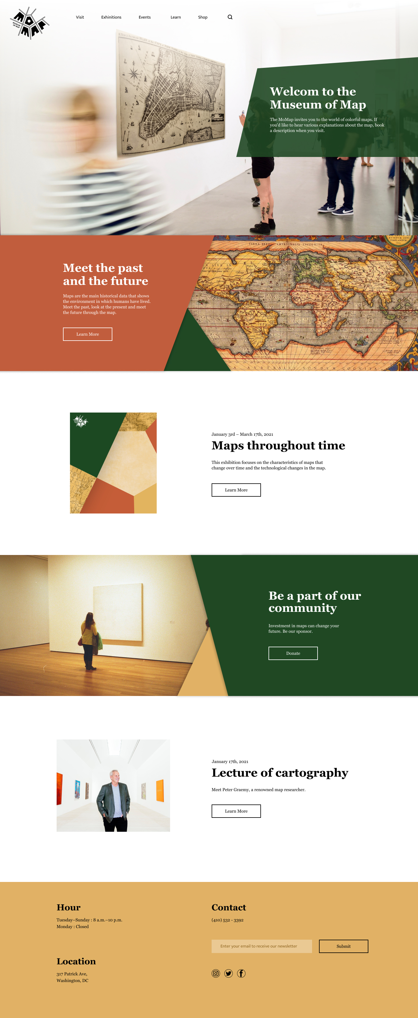
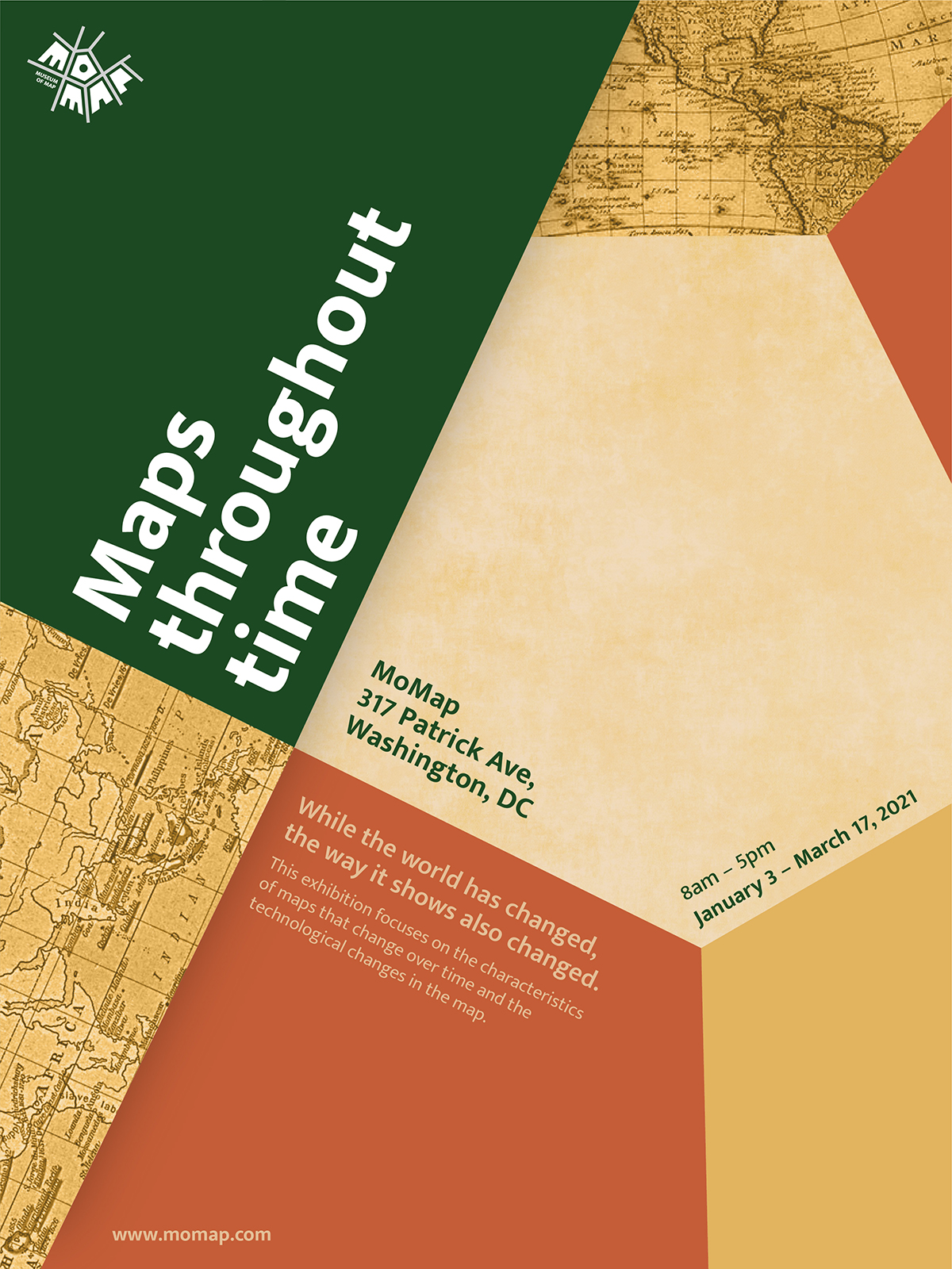
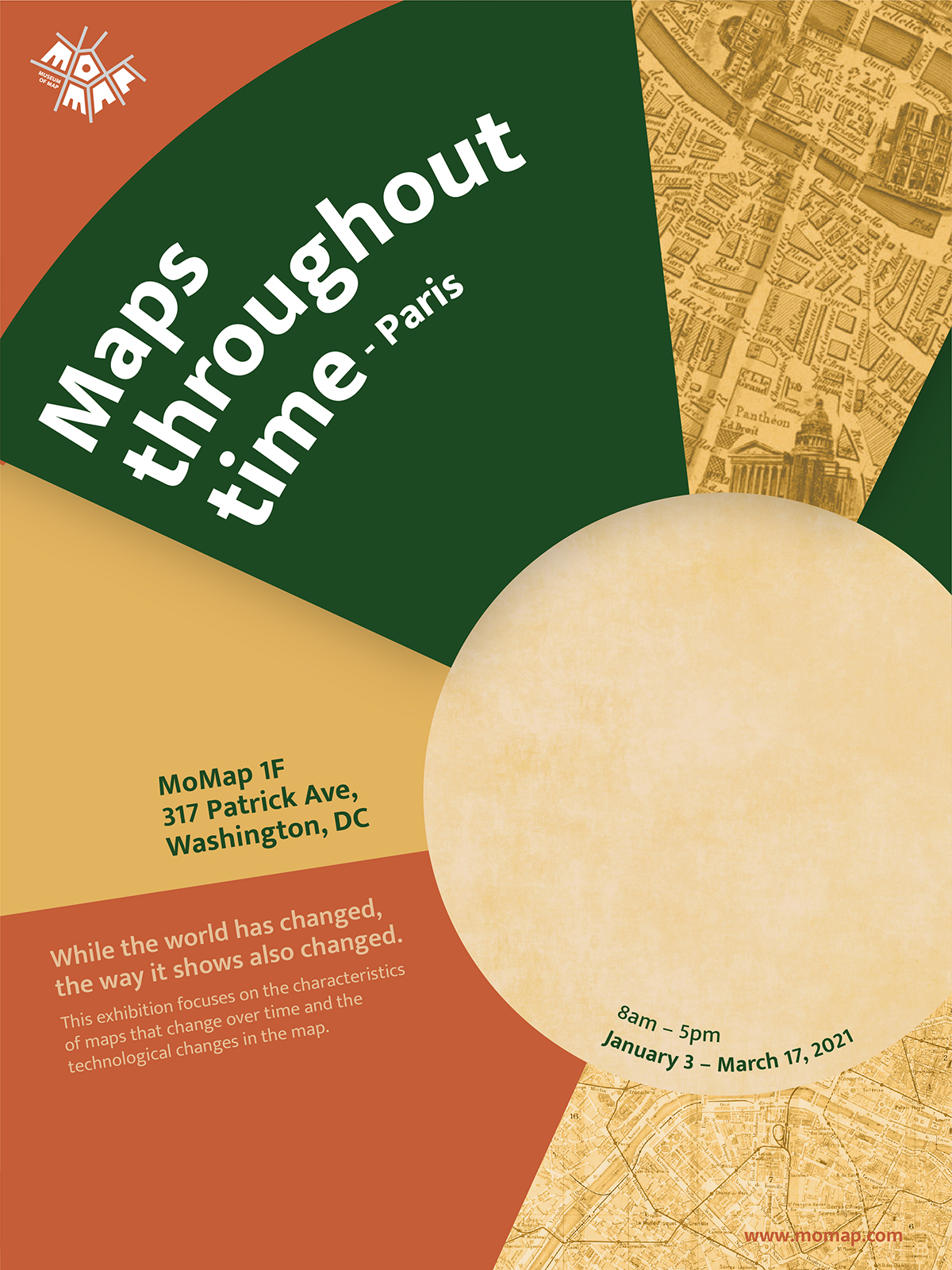
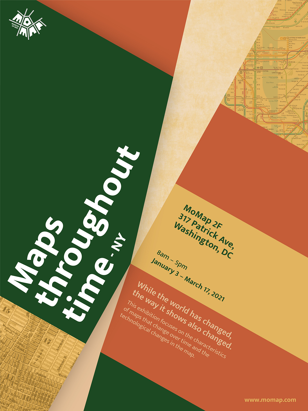
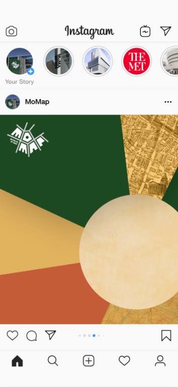
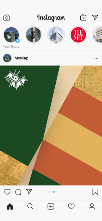
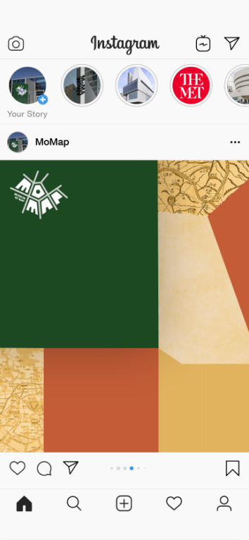
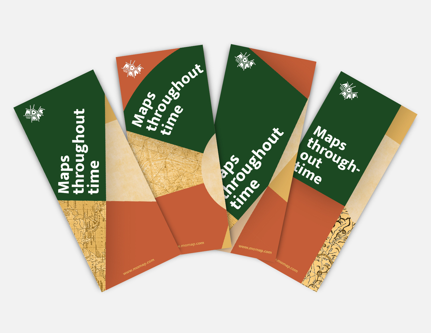
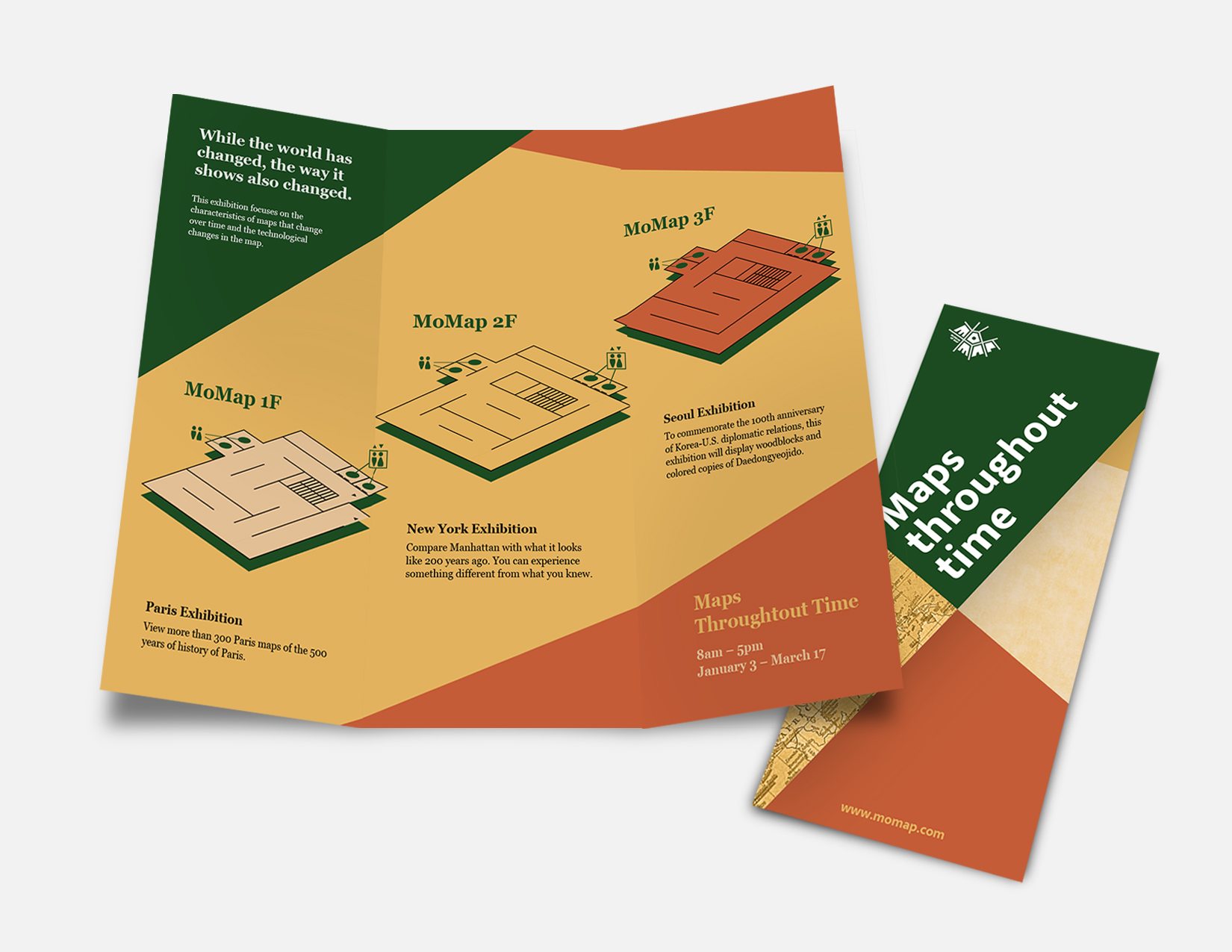
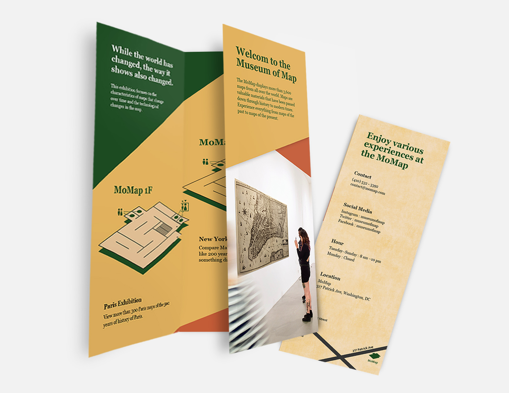
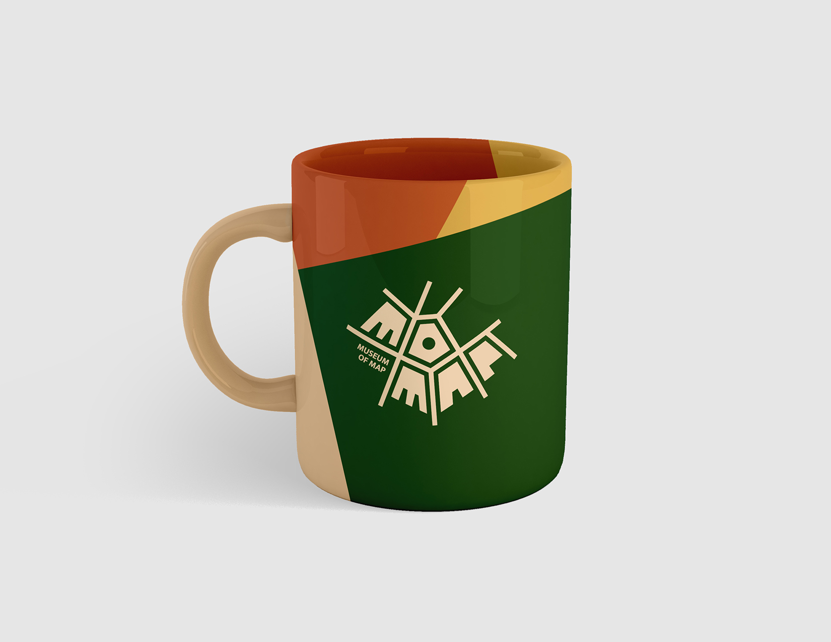
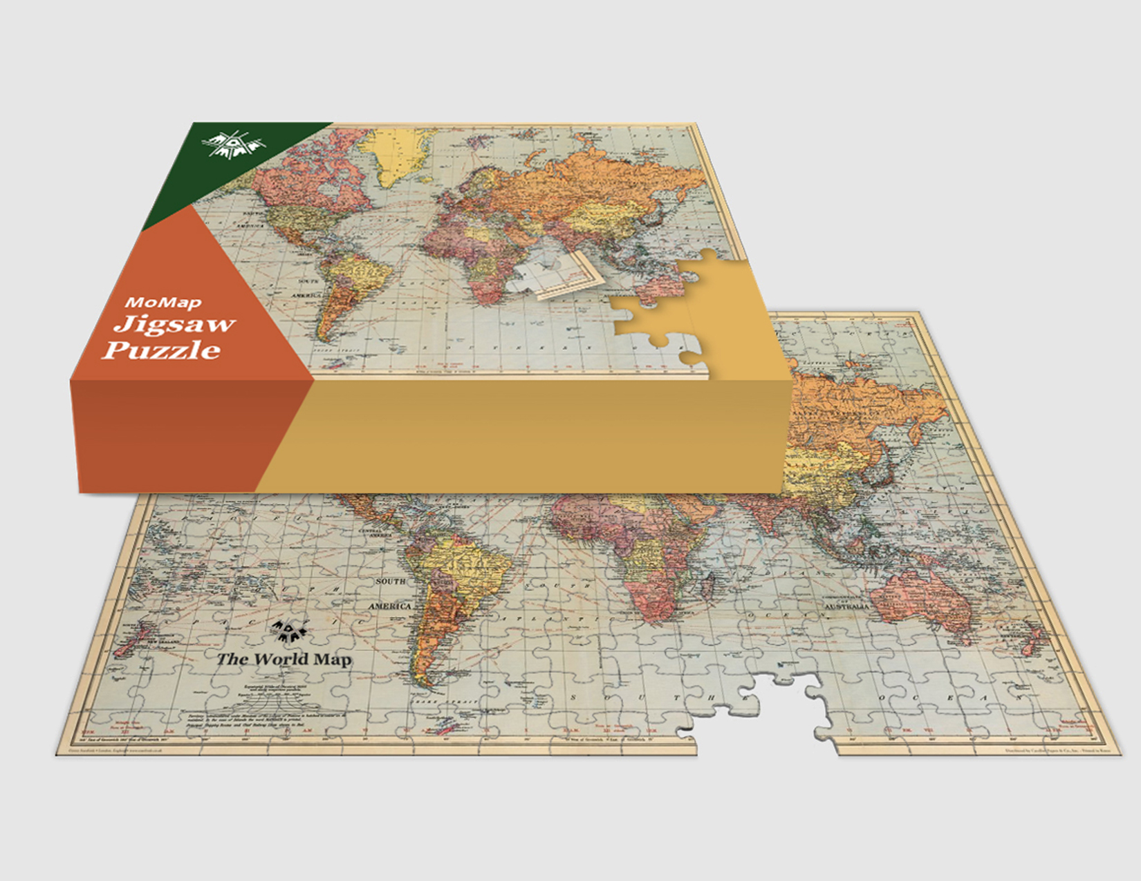
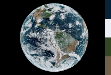
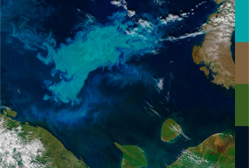
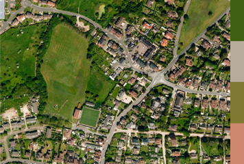
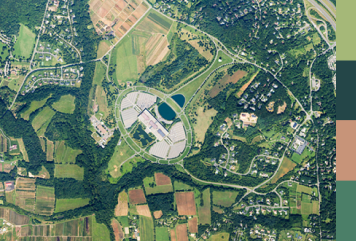
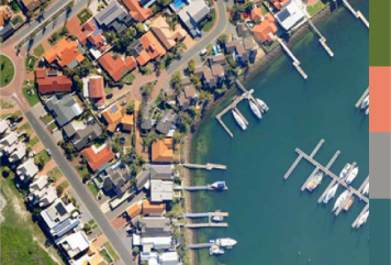
Designed a branding system for MoMap, a map museum, using geometric elements found on maps and colors found on Earth. Conducted research on the museum's history, mission, and target audience to create a logo and brand style guide for consistency. The result was a visually appealing and cohesive brand that helped the museum connect with its audience and stand out in the market.
Role
Graphic Designer
Duration
Mar.2020 – May.2020
Goal
Developed a logo and branding system
Target audience
MoMap's visitors and target customers
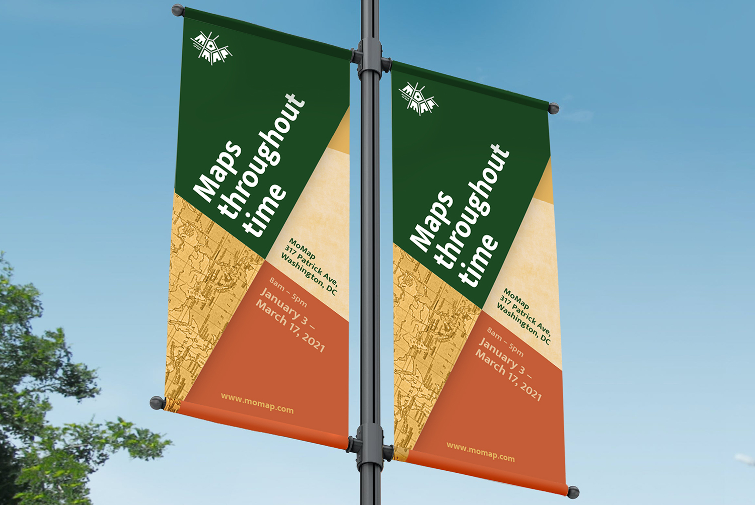
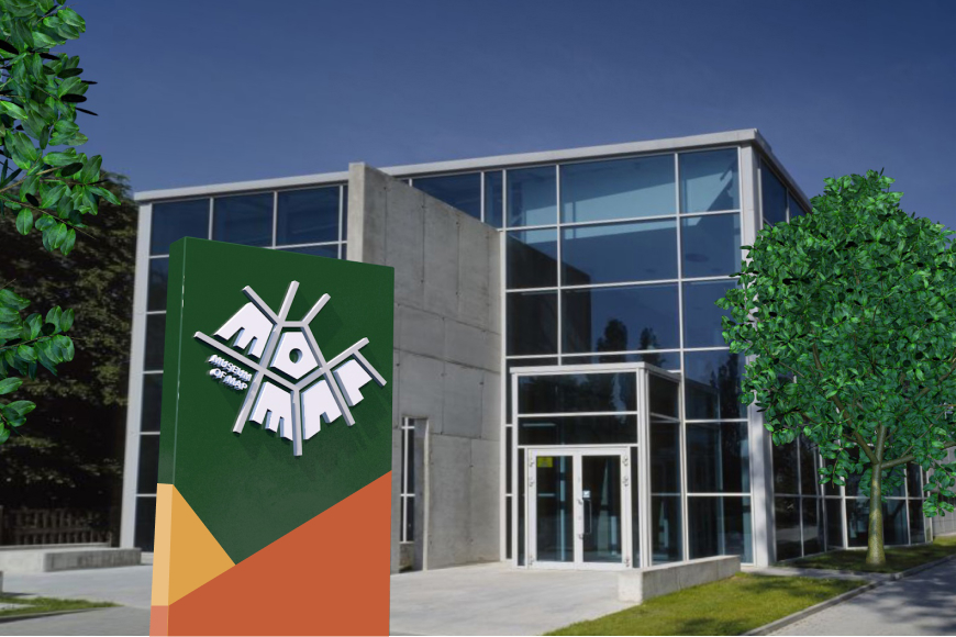
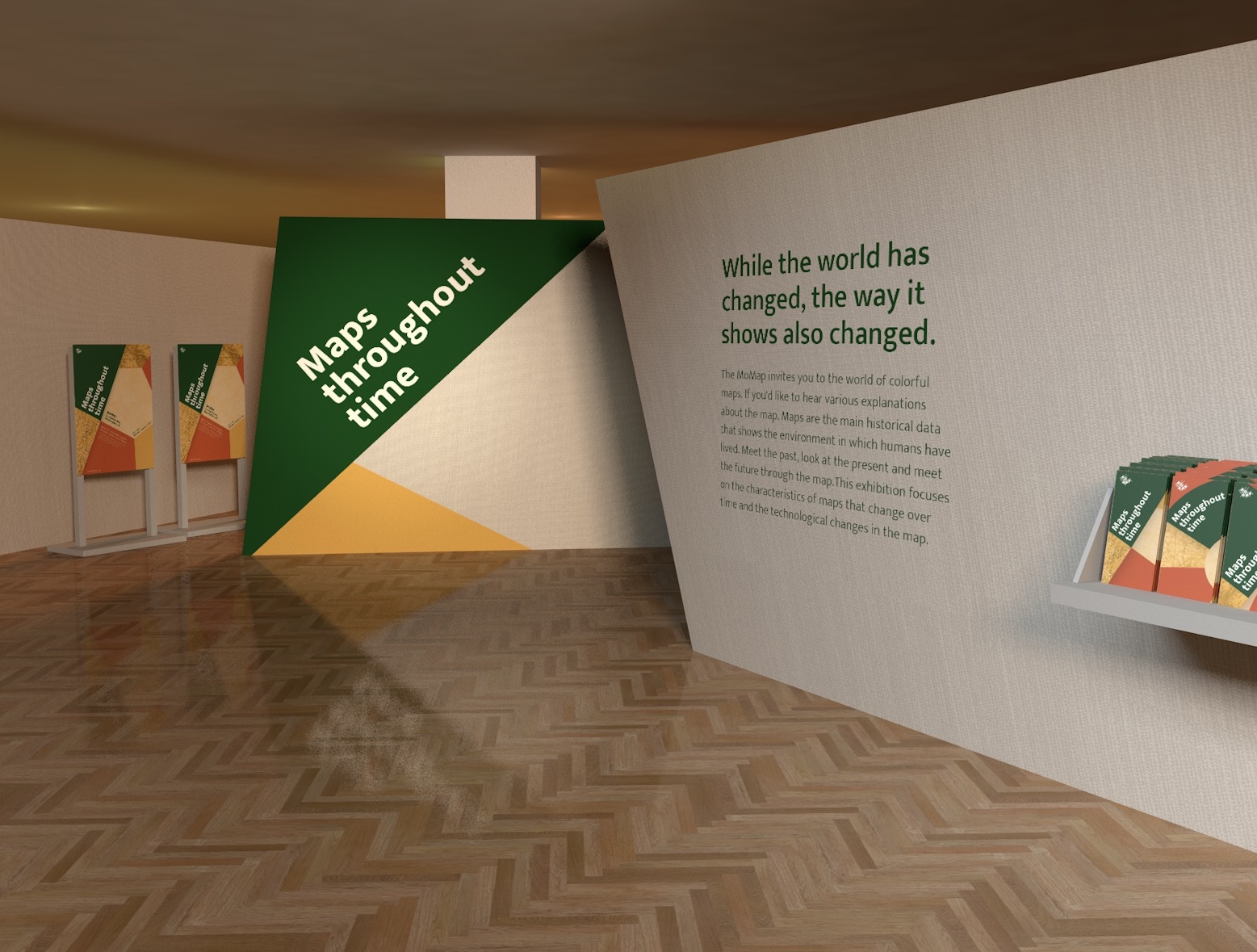
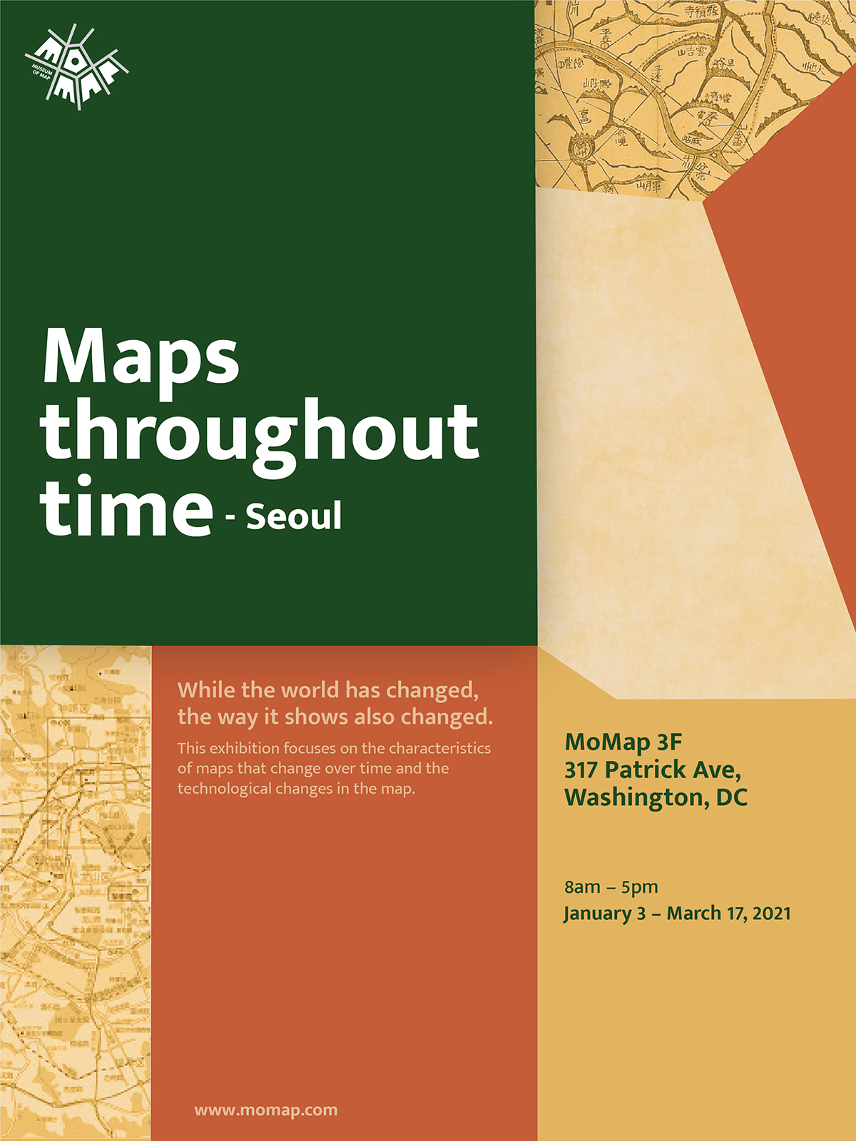
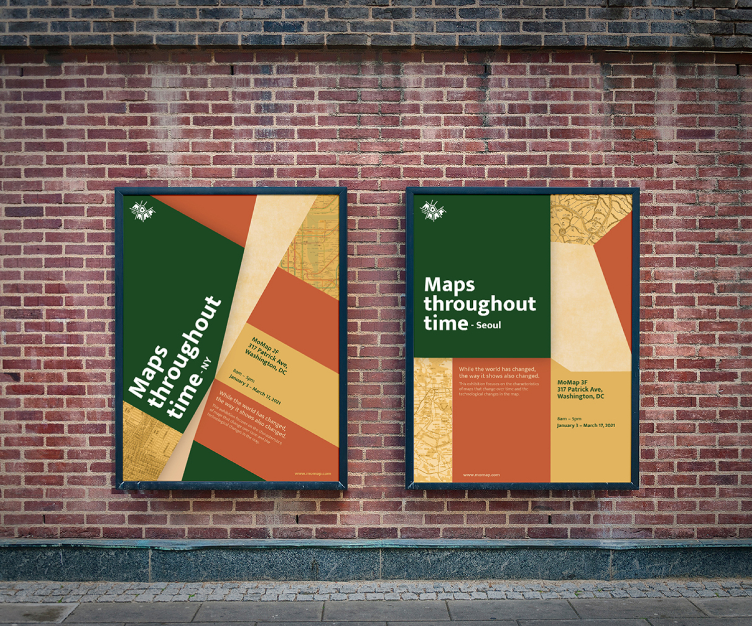
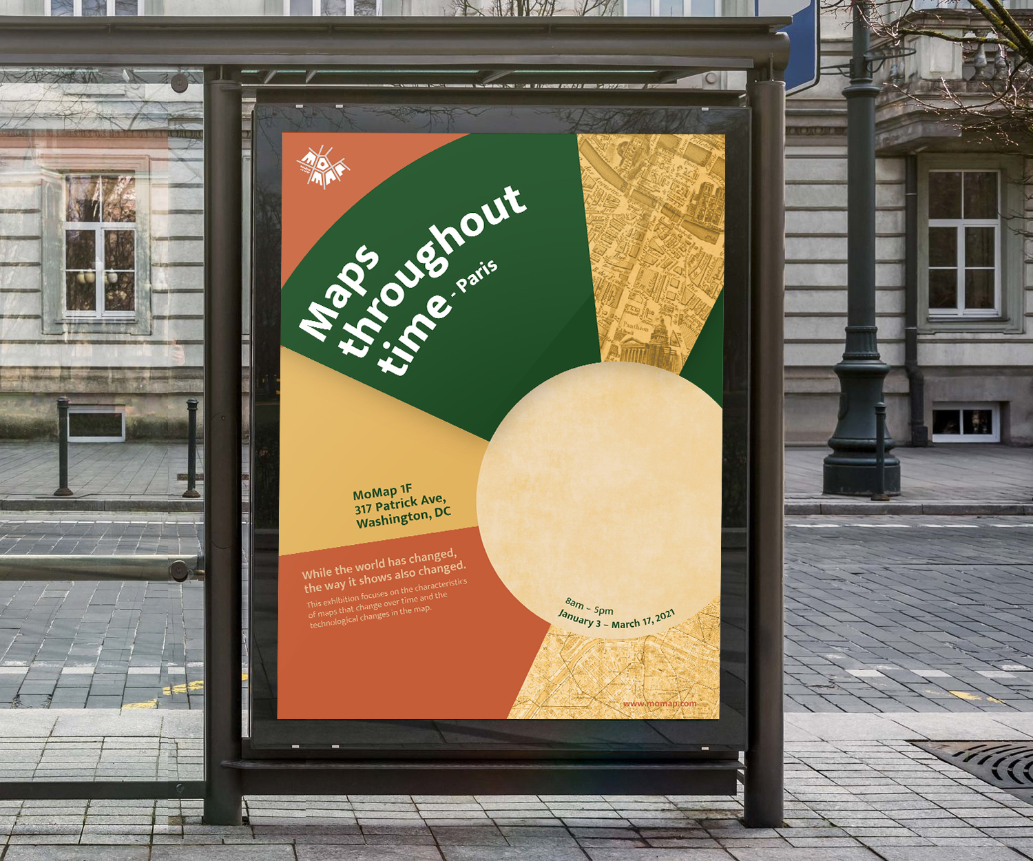
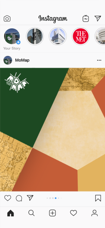
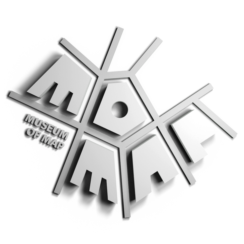
The MoMap logo features a top view representation of buildings and roads. It is originally designed in black and white and has a brand system consisting of geometric shapes and distinctive colors.

RGB: 219, 219, 219
CMYK: 13%, 10%, 10%, 0%
HEX: #DBDBDB
RGB: 133, 133, 133
CMYK: 50%, 42%, 42%, 6%
HEX: #858585
RGB: 0, 0, 0
CMYK: 75%, 68%, 67%, 90%
HEX: #000000
RGB: 255,255,255
CMYK: 0%, 0%, 0%, 0%
HEX: #FFFFFF
RGB: 239, 202, 163
CMYK: 5%, 21%, 37%, 0%
HEX: #EFCAA3
RGB: 207, 93, 53
CMYK: 14%, 76%, 89%, 3%
HEX: #CF5D37
RGB: 237, 190, 95
CMYK: 7%, 25%, 73%, 0
HEX: #EDBE5F
RGB: 28, 73, 34
CMYK: 84%, 43%, 100%, 49%
HEX: #1C4922